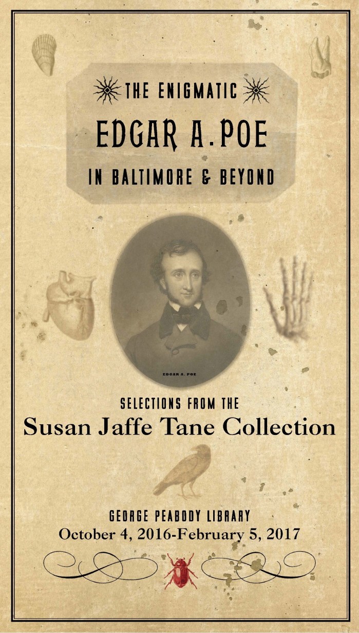
Dave Plunkert’s perfect banner design for The Enigmatic Edgar A. Poe in Baltimore & Beyond says everything we needed to say in a nutshell. Anchored by a portrait of Poe based on the 1849 mezzotint by John Sartain, it shows Poe as we don’t usually see him: an elegant, self-assured, non-mustachioed young man. This less familiar Poe is surrounded by images taken either from Poe’s publications (the shell in the upper left is from The Conchologists’s First Book) or from contemporary sources—images that we chose on purpose to get away from the conventional Poe iconography, Gothic and melancholic, and in order to show the close connection between Poe’s genuine scientific interests and his preoccupations with death and disease and mystery. (Close inspection reveals clues to some of his most beloved works: “Berenice,” “The Tell-Tale Heart,” “The Raven,” “The Gold Bug.”)
The papery background and textual lay-out, reminiscent of a fancy title page, recall the antebellum print culture that nourished Poe… but also kept him in a state of near constant poverty.
And of course, our decision to refer to him as “Edgar A. Poe” rather than the more familiar, now, “Edgar Allan Poe” was a shout-out to Poe’s own preference as an author. He sometimes used the “Allan,” perhaps when he wanted to add some extra class to his signature (so many nineteenth-century authors used three names); but as he had been more or less disowned by his foster family the Allans after many disappointments and misunderstandings, it could not have been a comfortable name to claim.
For more on the exhibition and all its moving parts, see the summary on this page.
